


La primera opción para incorporar texto impreso a una estampa de heliograbado es incorporar dicho texto al positivo translúcido. En el caso de los positivos para heliograbado preparados mediante impresora de chorro de tinta, ello resulta muy sencillo al disponer de herramientas de procesado de texto en los programas de edición de imagen digital. Por lo tanto, texto, gráficos, logotipos o cualquier otra forma gráfica se pueden incorporar sin ninguna dificultad. En la Fig., 1 se muestra un rótulo incorporado a una de las imágenes de la serie “Die Mauer“.
The first approximation to add text in an heliogravure print is the inclusion the text into the positive transparency. If this transparency is printed by an inkjet printer, it is very easy because of the text process available tools in the digital image processing software. Then, text, graphics, logos or any other graphic element can be included without any constrain. The Fig., 1 shows a label included in one of the prints belonging the “Die Mauer” series.
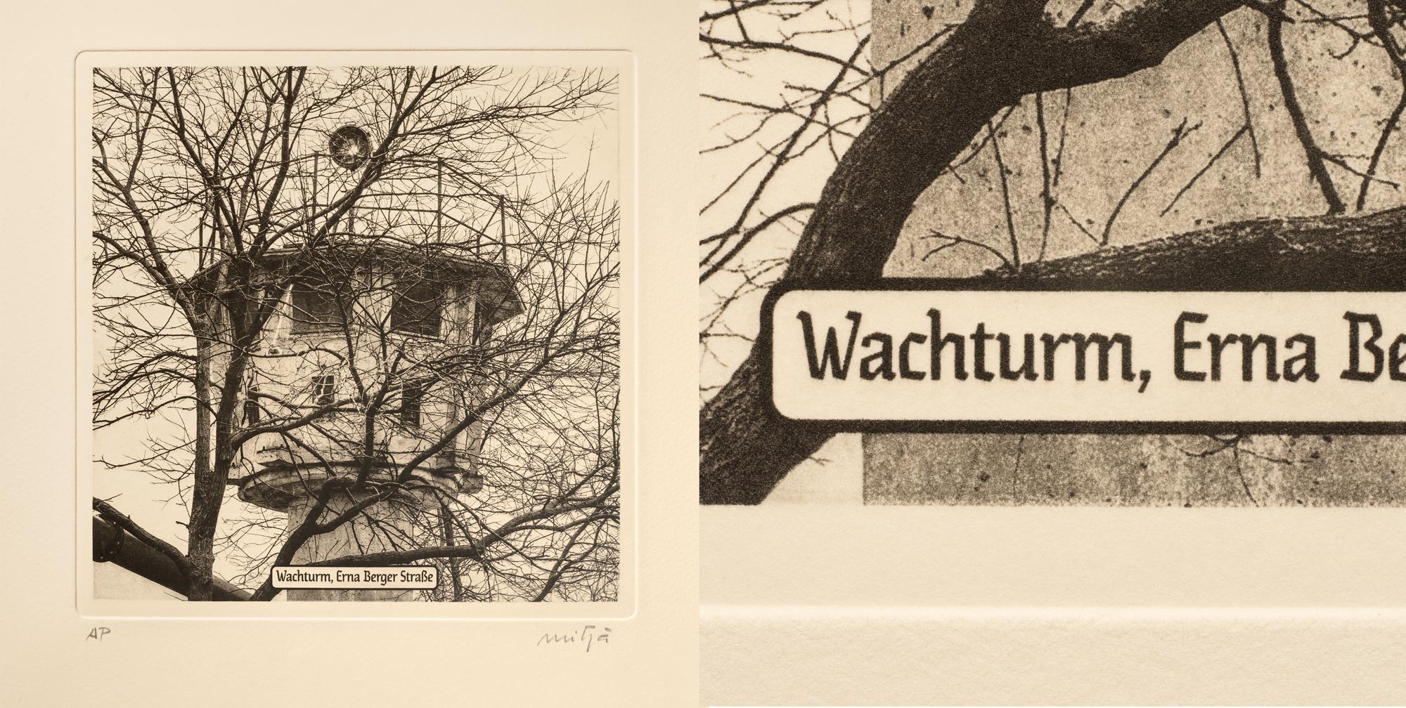
Al estar el texto incrustado en la transparencia positiva, éste se graba en la plancha de cobre de la misma forma que cualquier área de densidad máxima, negro máximo si la tinta empleada es negra. Obviamente, el tono del texto puede definirse a voluntad dentro de la escala tonal disponible. Entre las ventajas cabe citar la libertad de elección de la fuente o tipo empleada, tanto entre las disponibles en el sistema operativo del ordenador como las que se pueden encontrar de libre disposición o de compra en el mercado. No existen pues limitaciones al respecto. Otra ventaja es que no hay que ceñirse a un cuerpo de letra concreto, sino que puede escalarse al tamaño deseado en relación al conjunto de la imagen. Por último, cabe citar que el sistema permite incorporar al texto cualquier efecto gráfico como el rectángulo de esquinas redondeadas que lo enmarca en este caso. El caso mostrado tiene un cuerpo de texto aproximado de 17puntos en la estampa final. Este tamaño, relativamente grande y de un cierto grosor por el tipo de letra empleado (Escapade Fraktur), redunda en una buena definición de borde de la fuente a la distancia de visión de lectura de 35 – 40cm.
Quizá el único inconveniente de este sistema es que al tratarse de un grabado en hueco, las operaciones de limpieza de la tinta sobrante después del entintado de la plancha son muy delicadas. Éstas deben realizarse con sumo cuidado si se quiere preservar la densidad máxima de tinta en el trazo del texto y a la vez mostrar un fondo de blanco del papel completamente limpio. Estas dificultades se acrecentarán a medida que se disminuya el cuerpo de letra empleado. Por el contrario, sobre todo si el texto no ha de ir incrustado en la imagen, existe la posibilidad de imprimirlo aparte mediante las técnicas tipográficas, como se comentará en las siguientes entradas.
Being the text embedded in the positive transparency, it is etched in the copperplate in the same way as it is for any maximun density area, black for a black ink. Obviously, the text tone can be defined at will in between the available tonal range. An advantage is the free font choice, both from the available into the computer operative system as those of free access or payable that can be found in the market. Ther are not then any constrictions in this choice. Another advantage is that there is no need to be restricted to a font size in concret, but it can be scaled in relation with the whole image size. Finally, it must be mentioned that this system allows for the inclusion of any graphic effect as is the rounded corners rectangle framing the text in this case. The example above shown has a font size of approximately 17points in the final print. This relatively big font size and the thicknes of the font (Escapade Fraktur), provide a fine border sharpness at the reading distance of 35 – 40cm.
Perhaps the only drawback of this system is that being an etching technique, the wiping of the ink after the plate inking is very delicate. This wiping must be carefully done if it is wanted to preserve the maximum density in the text stroke both achieving a high cleanliness in the paper background. Those problems will be increased as it decreases the font size. Conversely, when the text is not necessarily embedded into the picture, there are the possibility to employ letterpress techniques, as it will be explained in the following posts.
