
A lot of literature has been written about the best way to inkjet printing life size negatives or positives, both intended for the so called alternative photographic processes. From the early days of digital image printer models to current photographic quality printers, a lot of proposals have been developed. Some of those methods were based on the quickly evolving technology in the area of fine printing on paper. This technology, sometimes named as Giclé, has been proven as almost equal the continuous tone attributed to the silver and other metals photographic technology. Perhaps the Quad Tone Inks for Epson printers by Jon Cone, all related supplies and QTRIP software has been the finest way to inkjet printing a photographic image both ensuring high resolution, the choice of final color cast, the tone gamut and a long lasting if the suited paper is chosen. A more simple way is the use of the original inks coming with the printer. For high end EPSON printers, this is the Ultrachrome Ink Set.
Nevertheless, when this technology is applied to Pictorico OHP, PermaJet or some other high quality translucent printing media, not always allows for so fine results as expected. Beyond the discussion about the level of capability to retain the tiny ink drops injected by the printer, those media persist in showing a certain difficult in properly separate the extremes of the tonal range. Both deep shadows and highlights tend to be blocked to some extend. Even applying correction or linearization curves this problem is hardly solved. This distinct behavior relating to the same technology applied to suited high quality papers, is related not only with the surface quality of the translucent media, but with the purpose the inkjet print is created for.
A fine inkjet print created with a photographic quality printer is intended to be seen by observers at a given distance and under a suited illumination. Accordingly, the ink drops dispersed onto the paper surface by the printer injection system have a series of properties related with this visualization needs. A first important property is that all ink drops on the paper are of colors the human visual system (HVS) can detect. That is, Black, Magenta, Yellow and Cyan, in addition to some variations as Light Magenta, Light Cyan or Light Black and LightLight Black (grays). The second property is that the ink drops must be so tiny that become undetectable in shape and size by the HVS. The blurring provoked by this lack in capability to resolve the ink drops, causes a visual process named integration that in turn, creates a high amount of tone and color combinations in order to emulate the information coming from the pixels of the digital image file.
As a corollary, all those phenomena belong to the so called visible spectrum (VIS), defined as the part of the electromagnetic spectrum being detectable by the HVS. Conversely, printing life size negatives or positives for alternative processes is intended “to be seen” by ultra-violet light (UV). Then, the goal of the ink injected on the surface of translucent media is to block some amount of the UV light used in the exposing step. Even though in the VIS a given tone of gray can be build with several and different combinations of colored inks, its opacity to the UV light can be partially or even completely different. Out of this scope are the silver processes that use visible light sources. This particular property of the inks employed in the photographic quality inkjet printers, has decided some practitioners to recommend the “only black ink” method in order to avoid undesired discontinuities in tones opacity and its corresponding UV blocking capability.
Printing with the option of only black ink causes in turn two derived problems. The technology employed in the inkjet printers involves a lot of complicated operations which main goal is to emulate the particular tone of each pixel. Referring to a given printer and its maximum spatial resolution, the number of drops per spatial unit and the intensity of the ink are the two basic principles in the tone building task. It is easy understood that there are also limits for this combination. Then, when a printer is solicited to build a “slightly different tone of white” in the highlights, the unique way to do that with the only black ink option, is to sparse tiny ink drops. This is correct in terms of perception by the HVS, because the integration process will merge the blurry viewed black points with the empty spaces between them, creating the corresponding very light tone. Something like this occurs in the shadows area. When the pixel gray value drops down to a given level, the proximity between the ink drops onto the translucent media surface tends to merge it blocking the in between spaces.
Both described alternatives, the use of the only black ink or all available inks, fail in one or another way. While the first hardly differentiates the tones in the extremes of the tonal scale, the second do not ensures a matching between the perceived tones in the print and the amount of UV light blocked. Therefore, it is necessary to look for a different approximation to the problem. Probably, the first issue to be solved is to know, for a given printer, UV light source and photographic process, which is the relative opacity to the UV light of the ink set available in the printer. With the stuff provided by the Quad Tone RIP (QTRIP) from Roy Harrington, there are several TIFF image files under the common name of inkseparation. The file is an image containing successive step scales for each ink in the printer ink set (Fig., 1). The steps of those scales are coded in relation of its ink coverage percentage in a units progression of 5%.
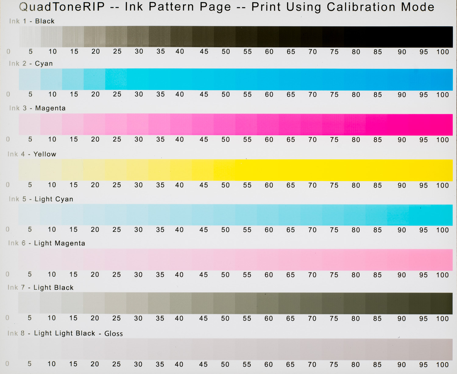
Choosing the appropriate file for the number of inks available in each particular printer, the image can be printed on the intended translucent media and used as a positive or negative through a given alternative photographic process. The Fig., 2 shows the result to printing the file with an EPSON R3000 printer under the QTR Print Tool application with the option No Color Management chosen and over Pictorico OHP translucent film. After that, the printed image has been used as a positive film for photogravure. The exposure under the UV light source is as usual. In this case, the gelatin of the carbon tissue has been transferred onto another piece of translucent film Pictorico OHP. A simple visual observation of the result will provide a first approximation to the particular opacity of each ink to the UV source employed.
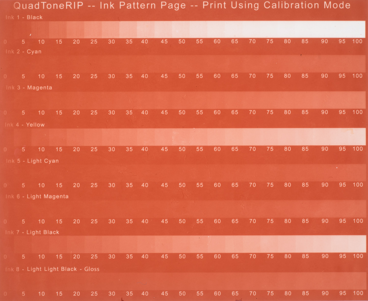
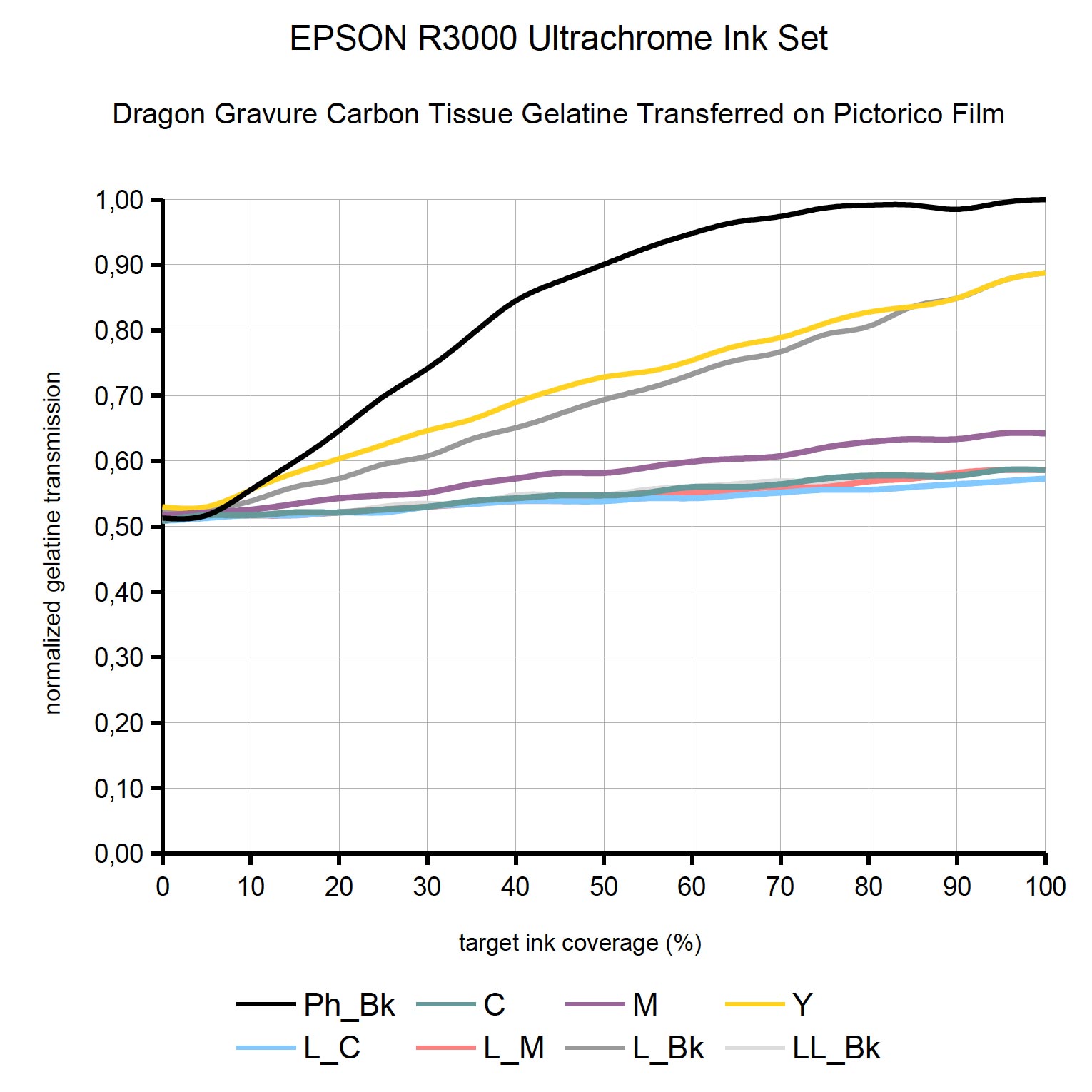
In this case (Fig., 2), it is clearly visible as only the Black, Yellow and Light Black inks have a real capability to block the UV light to some significant amount. This indicates also that the use of the other inks can provide a good visual richness of tones in the corresponding negative or positive, although this is not related with the response in terms of UV blocking. Scanning on the sheet of Pictorico carrying the transferred gelatin, the resulting gray value can be read out from every step and corresponding plots can be traced in a spread sheet. The Fig., 3 shows the relative UV blocking capability of the eight inks. Remember that these conclusions applies only for the printer, ink type and brand, carbon tissue, potassium bichromate concentration, UV lamp, exposure time and thickness of glass in the vacuum contact press used is this example. Any change in the described procedure and/or devices can drive to a slightly or even completely different result.
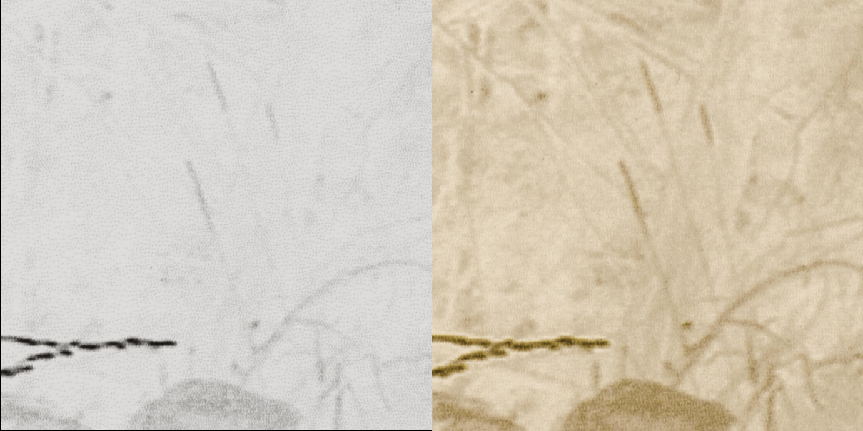
The strategy is then the use of those three inks better than the complete ink set. Here is where the QTRIP software and its PrintTool printing application reveal all their capabilities. Following the instructions from QTRIP files, it is possible to prepare a dedicated profile favouring the use of the three mentioned inks in the building of the complete tonal scale and controlling the total dynamic range of the negative or the positive. Fig., 4 and 5 show comparisons between the same sector of a negative intended for Palladiotype. At left, printed with the method of only black ink. At right and in this case, with a fine tuned mix of Black, Yellow and Light Black inks. The image file used is exactly the same in both cases, a 8bit Grayscale uncompressed TIFF.
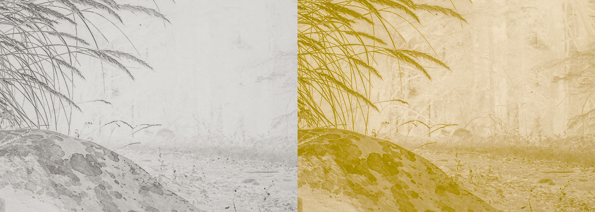
Looking at the details in the shadows area shown at the Fig., 5, there is easy to note that the building of tones in the case of the use of only black ink tends to simplify the complexity coming from the file data. Separated tiny black ink drops cannot reproduce the richness contained in this picture area. Even simple visual perception can be aware of this lack in tone reproduction. As a consequence of these small and separated black drops, the quantity of UV light reaching the sensitized paper or carbon tissue is higher than the expected by the corresponding tonal value. The version printed with three inks shows a better variety of tones and an almost continuous tone even in the magnified detail.
As a final reminder. Printing systems are intended for a given and specific purpose. Obtaining a fine tone and/or color reproduction in prints suited to be observed to the naked eye is a quite different task than printing to build an UV light blocker. This is the goal when printing life size negatives or positives for alternative photographic processes. This is an interesting field of research and probably in the future will be available other improved technologies that compel us to revise the best option again. Considering this perfect coexistence of new and old technologies is, in my opinion, not the unique but a good reason to practice hybrid alternative processes.

Thank you for an excellent article. You’ve simplified and made clear the main issues in using Cone’s inks, Quadtone rip, and Pictorico OHP.
LikeLike
Many thanks Peter. To share helps also to improve knowledge. Thank you for reading.
LikeLike