
Deep, dense, rich, velvet and other adjectives are often used to describe the black richness in héliogravure (photogravure on copperplate). The choice of the ink and the way this ink is laid onto the paper surface, lends to the photogravure print a uniqueness not so easy to explain beyond the direct visual experience. But this feature involves also a certain difficult to successfully choose the ink. The matter embraces a lot of technical and aesthetic considerations. Fluidness, resistance to heat, behavior by oil addition, wipe easiness, more or less persistence of plate tone and many others can be considered among the technical aspects. Colour bias and matt or glossy aspect when dried, are properties affecting mainly to the aesthetics.
Some of the above listed ink properties will influence also the tone distribution. In a given etched copperplate, the different tones are build by a combination of several factors monitoring the ink charge at plate level and the final amount of ink transferred to the print paper surface. Among this factors, we can consider those:
- The depth of the etched well in each tone area.
- The lateral etching action in each tone area. It is dependent of time and then, for a given total etching time, it is bigger in shadows than in highlights.
- The size of flat clean copper space between wells. It is initially determined by the aquatint screen scheme, but it is more or less modified by the lateral etching present in a given tone area.
- The ink stiffness (viscosity, fluidity, …) and its temperature.
- The plate temperature.
- The ink ability to spread up over the paper under the pressure applied by the etching press.
- The grade of paper dampening allowing or constraining the penetration of the ink into the paper fibers. The more the ink penetrates into the paper, the less is it visible on the paper surface.
- The roughness of a given paper fibers.
- The amount of sizing in some papers.
- Other not clearly defined interactions between a given ink and a given paper.
As etching proceeds mainly in depth, but also laterally to some extend, the clean areas of copper between the etched wells is narrow in the shadows than in the mid tones or in the highlights (Fig., 1). Hence, if a given ink shows a tendency to difficult the cleaning of the so called plate tone, this will affect in a quite different way over the tonal range. Moreover, the plate tone cleaning would be easier to perform on an extended white area than in the small areas between the etched wells for a mid gray tone. Each combination of ink and paper will show a result derived by a complex combination of all or part of those factors. Therefore, it is only under comparative trial that some conclusions can be extracted.
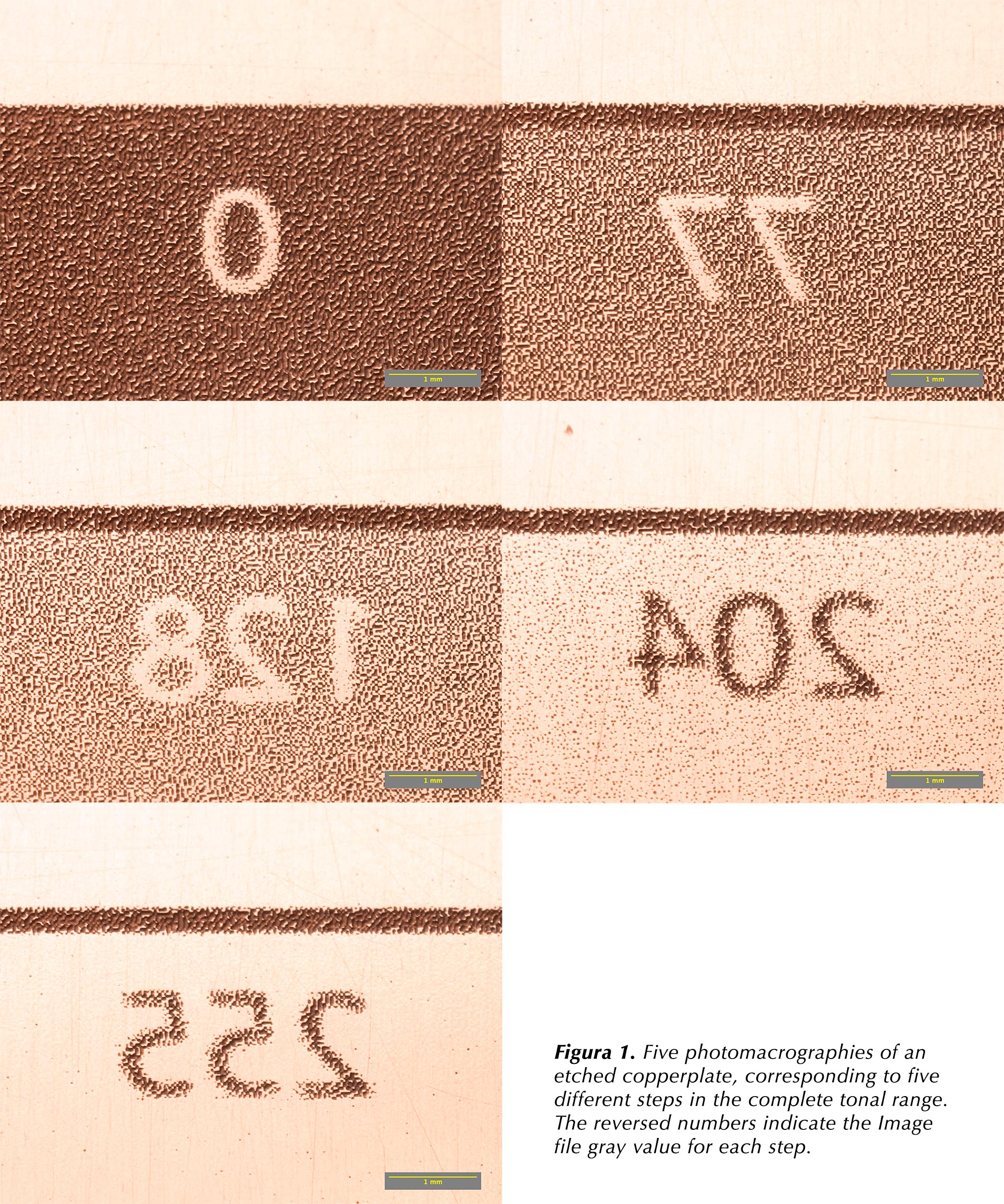
As an example of above discussed, here follows a comparative test of four different black inks on the same printing paper. The trial has been performed by printing the same plate on four different pieces of paper. The image in the plate is a test picture with pictorial content and a gray scale of eleven equally spaced steps from 0 to 255 gray value. The paper dampening, the paper blotting, the plate and ink temperature, the inking, the wiping and the cleaning of the plate tone has been repeated as roughly equal as can be expected from a hand made procedure. The inks under test have been taken from those used by the author with more or less subjective success during the last four years. Two main goals to achieve with the test is to look for the higher density of black and to compare the ink tone (warm, neutral or cold). Test parameters:
- Paper: Arches Platine 300g/m2.
- Inks: Gamblin Bone Black, Gamblin Carbon Black, Charbonnel Noir de Carbone and Charbonnel Noir 55981.
- Calibration method has been adjusted in order to obtain a quite linear print in density with the ink Bone Black from Gamblin, the most often ink used in the last months. Remember that linear means equally spaced gray scale steps in density at print stage. This matches the equally spaced density in the positive transparency. Contrast, which is decided before at Photoshop processing, will not be affected by this linearity. The idea is to obtain an observer visual perception on the print as close as possible to the viewed on the computer display from the edited image file.
- Density: Reflection Density measurements have been taken from all the gray scales. The densitometer, a Viptronic Vipdens 130, has been zeroed at the White patch of gray scale contained in the Q13 Kodak Color Separation Guide and Gray Scale (small).
- Photographic reproductions: In order to take measurements from the results, the dried prints have been reproduced by means of a digital camera Sony A7II equipped with a Nikon Micro-Nikkor 55mm f/3.5 lens. A couple of professional flash strobes have been used as light source.
- Image processing: The camera files have been processed by Adobe Camera Raw. The image measurements have been done with several available tools in the Fiji image analysis software.
Results:
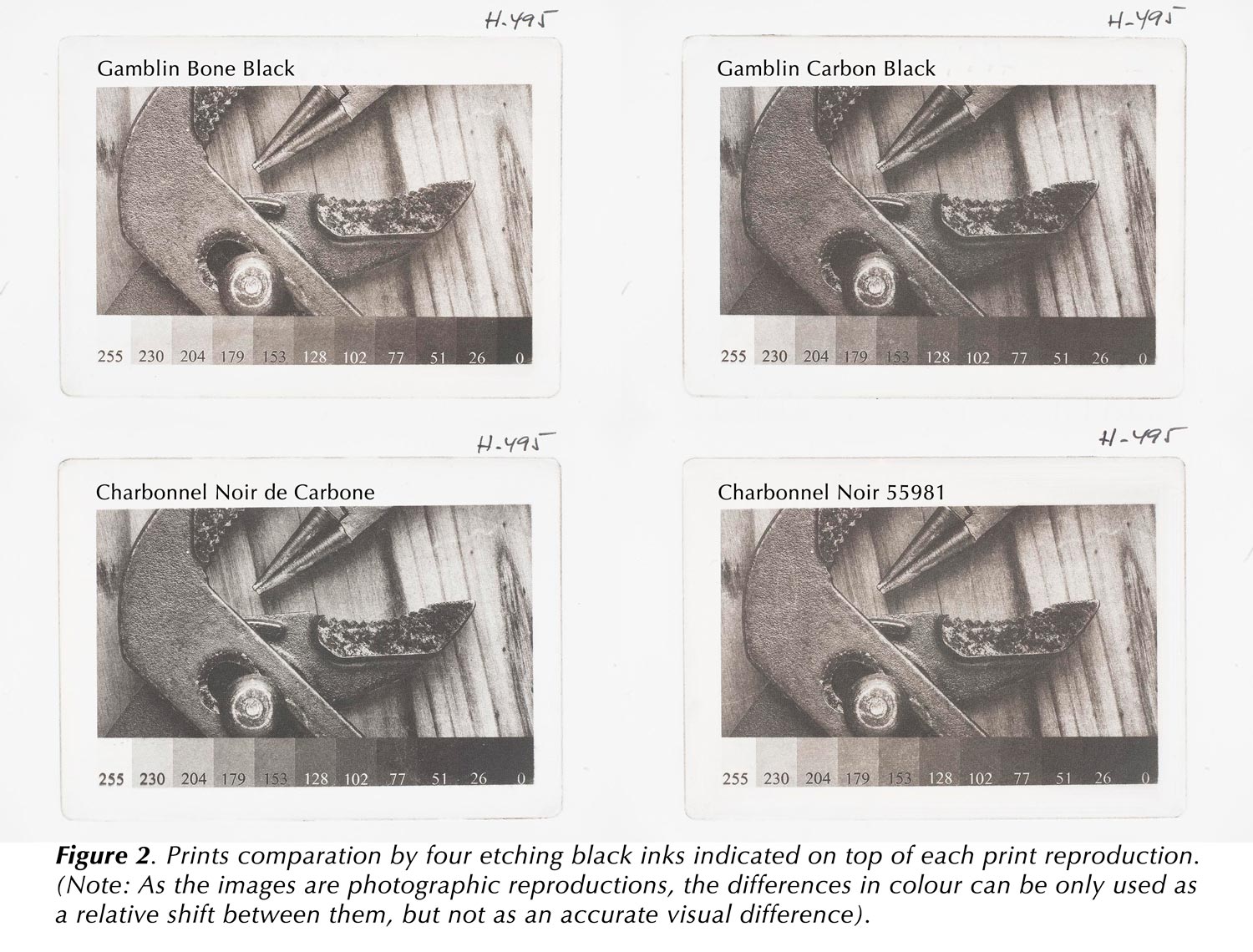
- A composite image with the four prints reproduction for first glance visual analysis, Fig., 2.
- A composite image with the four density plots extracted from the respective gray scales in each print (Fig., 3).
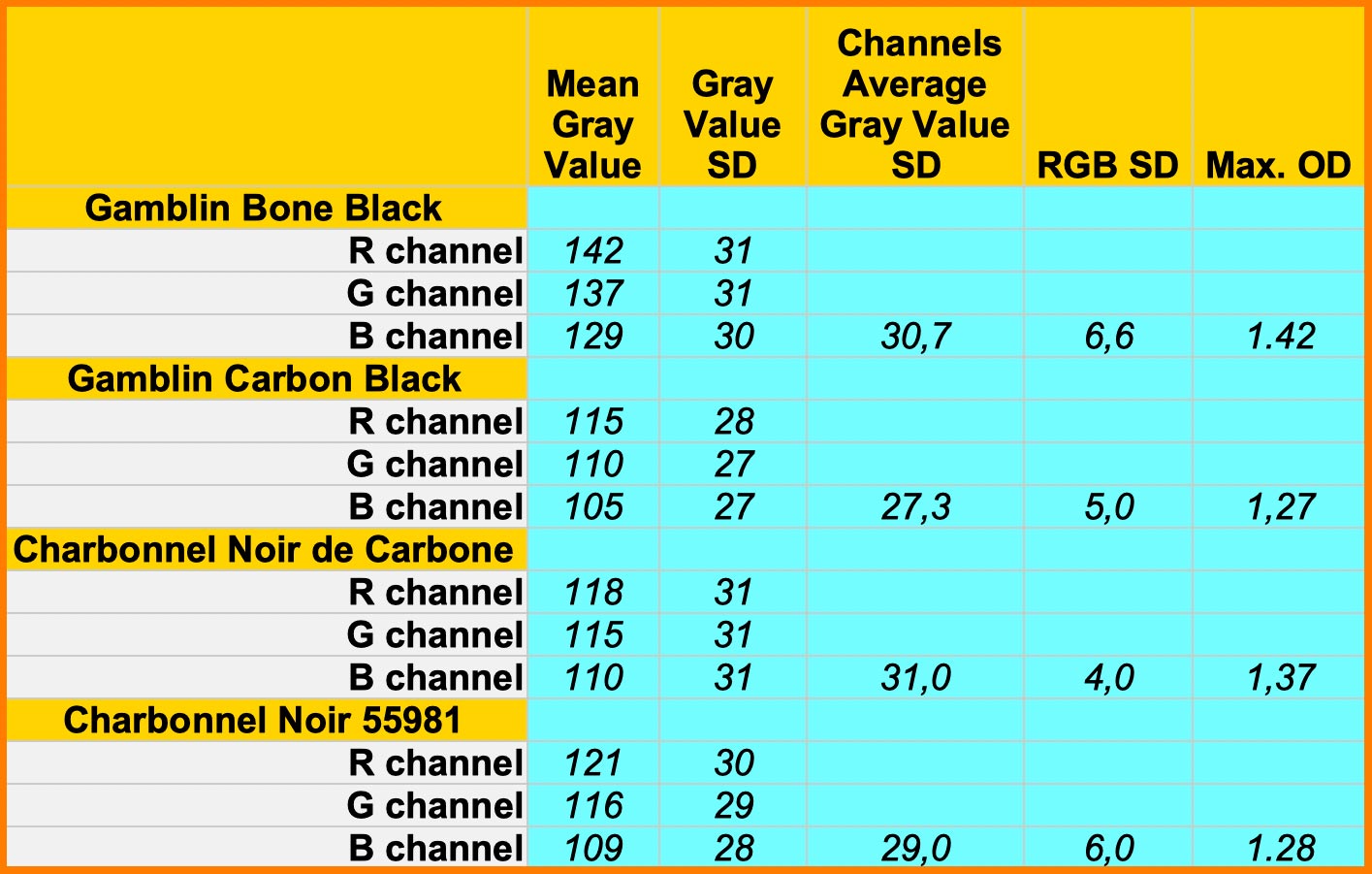
- A resume of data extracted from de respective 128 gray value patch on each gray scale (Table 1).

(click to access an enlarged version)
Conclusions:
- The linearity obtained with the Gamblin Bone Black ink is very close to the target, while the linearity of the other prints shows a certain departure from the ideal target. In general, there is some difficult to show a clear tone separation between the first two or three steps in the test gray scale (steps 0, 26 and 51).
- Inks other than Gamblin Bone Black show diverse amounts of excessive density in the medium gray steps. This lend to dull prints.
- The difference between the highest (Gamblin Bone Black, 1.42OD) and the lower black densities (Gamblin Carbon Black, 1.27OD) is very important in terms of perception. A difference of 0.15OD means 50% more light reflected by the black patch. The black step on the Charbonnel Noir 55981 print is also very close to this low density value (Max. OD column in Table 1).
- All tested inks show a similar ability to provide a certain smoothness in a flat patch of medium Gray (128 gray value). The Standard Deviation measured in this patch is quite equal for all prints (Channels Average Gray Value SD column in Table 1).
- All blacks from the four inks have a tendency to warm black, being the Charbonnel Noir de Carbone the most neutral (RGB SD column in Table 1).
- If other than the Gamblin Bone Black ink is used, the method needs a new calibration in order to maintain the linearity in the resulting print (Photoshop Curve, QTR curve, etc.)
- If a more neutral black is preferred in the print and looking at the above results, there are three main options:
- The first is to tray mixing Gamblin Bone Black and Charbonnel Noir de Carbone inks. Then, the print density plot will show if the gray scale linearisation has experimented significant changes.
- The second option is the same as described in first place with a dedicated curve of linearisation.
- The third option is to linearise the image to be adapted to the solely Charbonnel Noir de Carbone ink.
- Any idea about mixing inks should be checked printing this test plate and plotting the gray scale densities. The output density will suggest the need for an eventual linearisation curve. Obviously, all this hypothesis have been derived beginning by a plate adjusted for the Gamblin Bone Black ink. Other exposure and/or QTR, Photoshop Curve adjustments would be used if the initial target were another ink.

I no volies fer la tesi! Què és això sinó?
LikeLike
Ha, ha, ha!
LikeLike
As ever, inspiring and informative in equal measure, thank you.
LikeLike
Thank you for reading John
LikeLike