
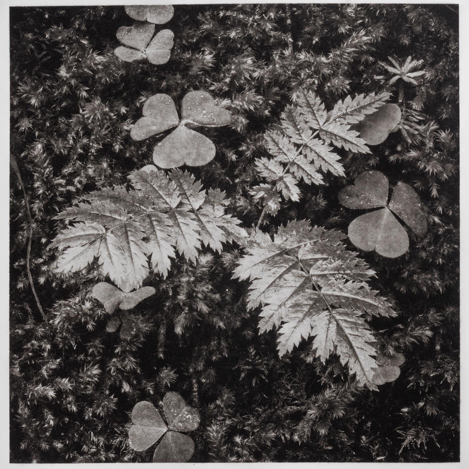
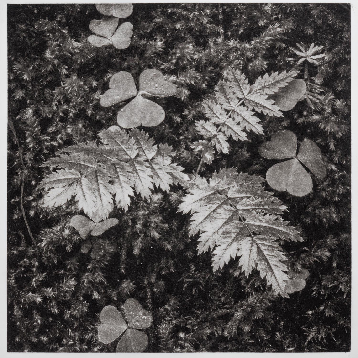
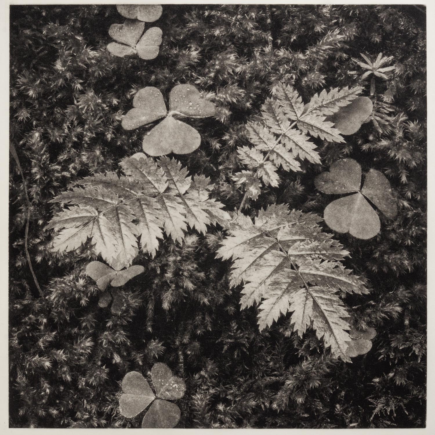
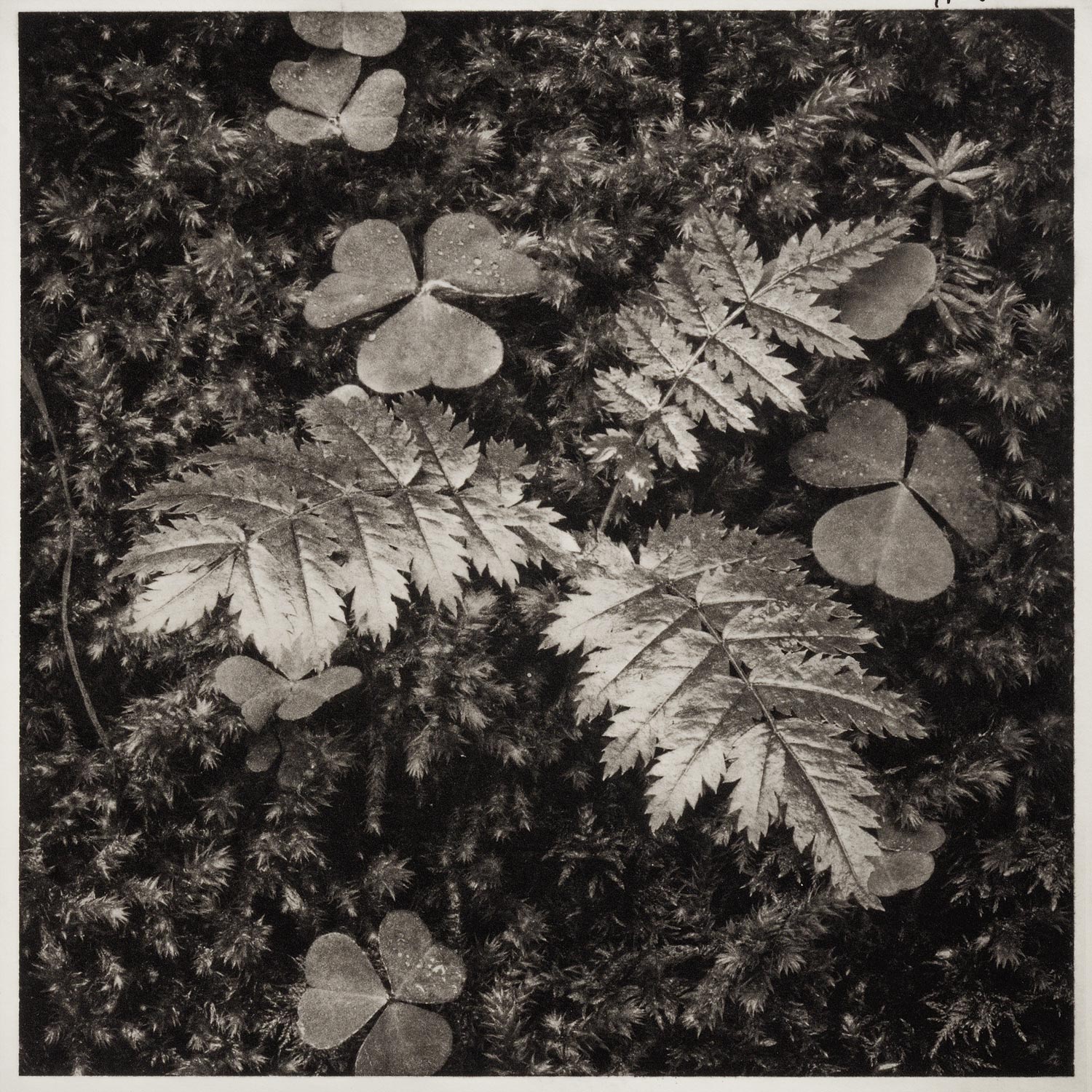
 In the last post Heliogravure X – Black…?, what black?, there was discussed how the ink employed affects the black density and also how it could compromise the tonal range, among other factors. Here, we will try to look at how the same ink influences the picture over different papers. The plate chosen for this comparison is the “Leaves #7” of 20x20cm. The papers used are those listed below. Two are qualified as neutral white, while the others show a creamy-warm cast:
-
-
- Arches Platine, 300g/m2.
- Somerset Satin White, 300g/m2.
- Somerset Satin Soft White, 300g/m2.
- Saunders Waterford HP, 300g/m2.
-
The ink employed in all four cases is the Gamblin Bone Black. The tonal range and black density shown by this ink was the better result in the former Heliogravure X – Black…?, what black? post. Therefore, the comparison assumes one has a decision about the ink and the matter is to analyse its behaviour onto four distinct papers.
In order to make the assay as reliable as possible, the four prints were inked, wiped and printed in the same session following the standard procedure (standard for the author). Then, they are reasonably equal as far as it is possible with any hand made procedure. The prints photographic reproductions have been taken with digital camera in raw file format. These raw files have been processed in Adobe Camera Raw and color balance was standardized through the white patch of a Kodak Gray Scale strip reproduced in parallel with the prints (Fig., 1, 2 3, and 4).
Looking at those reproductions it is not so difficult to observe some differences:
-
-
- Comparing the neutral white papers, the print on Saunders Satin White is perceived as a bit more contrasty than the printed on Arches Platine paper.
- The same effect is perceived comparing the couple of warmer paper prints. The printed on Somerset Satin Soft White looks as slightly more contrasty.
- The print on Arches Platine paper shows higher amount of graininess than that printed on Somerset Satin White paper.
- The same could be said in the case of the print on Saunders Waterford HP. It shows a higher amount of grain than its counterpart on Somerset Satin Soft White paper (Fig., 5).
- In the prints on the warmer papers, the ink seems also to be warmer than in the neutral white papers. This is perception effect because the ink is always the same (Fig., 5).
-
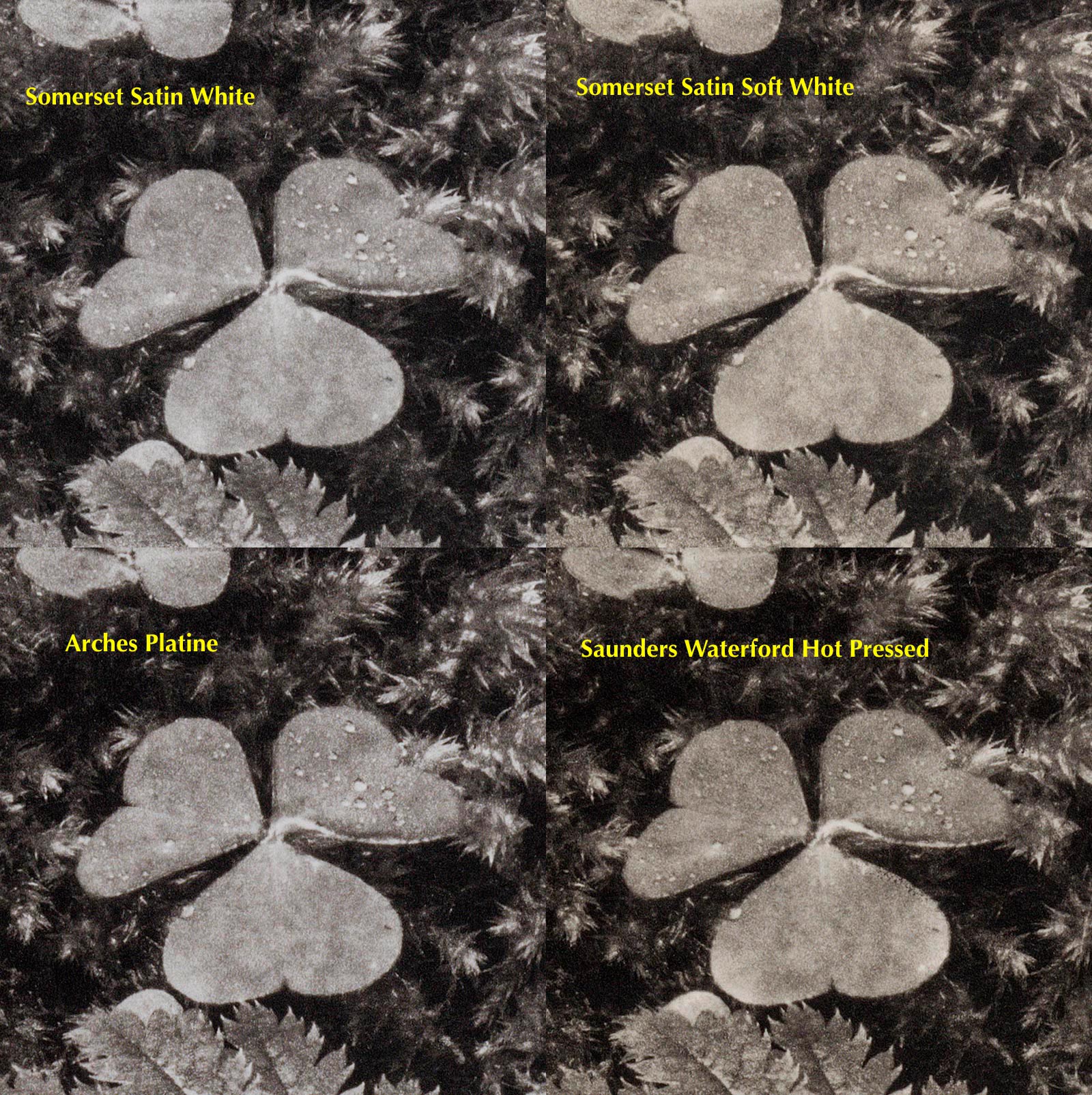
It is not so easy to pronounce a sentence, nor it is the goal of this text. More than a ranking of performance, there is an evidence of distinct behaviours. The features of each ink-paper combination can be used to perform different interpretations of the same picture at printing level. For instance, if we prefer a look close to traditional photographic cleanness, probably we will choose the print on Somerset Satin White. Conversely, if our goal is prone to a more Pictorialism appearance, then we will choose between the couple of warmer papers and the decision is about the amount of graininess. Many other arguments could be exhibited supporting any theory about how a picture should appear as a print. There are also as ways as practitioners to do that, but a solid method with reliable results will be a valuable aid allowing to concentrate efforts in aesthetics.
